https://thegymnasium.com/take5/designing-beautiful-focus-states
Control your focus styles for people that access the website using a keyboard or similar:
Link outline:
- style it to override browser defaults
- Color
- 2px dotted outline (instead of 1px)
a:focus {
  outline: 2px dotted;
}
a:hover, a:focus {
  color: orangered;
  text-decoration: none;
}
a {
  color: #a6540b;
  transition: color 0.15s, outline 0.15s;
}
Forms:
- box-shadow to let the focused input pop up
- override default outline styles of browser
- Transition if you want
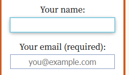
input[type="text"]:focus, input[type="email"]:focus {
  outline: 2px solid rgb(135, 205, 226);
}

input:focus {
  box-shadow: 0 0.1em 0.5em rgba(0, 0, 0, 0.5);
}

input {
  border: none;
  display: block;
  font-size: inherit;
  transition: outline 0.2s ease-in, box-shadow 0.2s ease-in;
}
Image/ gallery
- override default outline
- box-shadow
- scale
- optional: saturation filter
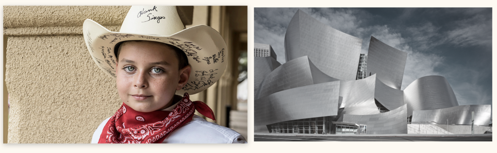
.gallery-link:focus {
  outline: 3px solid rgb(42, 147, 181);
}

.gallery-link:hover, .gallery-link:focus {
  box-shadow: 0 0.25em 1em rgba(0, 0, 0, 0.25);
  transform: scale(1.025);
  filter: saturate(1);
}

.gallery-link {
  display: flex;
  filter: saturate(0.15);
  transition-duration: 0.15s;
  transition-property: box-shadow, filter, transform;
  transition-timing-function: ease-in;
}